How to make a dense table easier to scan?
By Rosario Meza
Before I change a table’s layout, I ask what people need to spot first. In a service-request queue, that might be what’s due next, who owns it, and which requests need review. That gives me a starting point for deciding which columns to show, where to place them, and what belongs in the details.
| Request | Due date | Status | Owner |
|---|---|---|---|
| Replace lobby signage | Dec 3 | In progress | Facilities |
| Update visitor check-in form | Dec 4 | Needs review | Operations |
| Review meeting room access | Dec 5 | Complete | IT Support |
Put the decision-making columns first
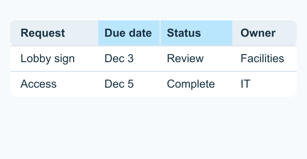
Start with the row’s identifier, then place the fields people use to make a decision nearby. For a request queue, that could mean request name, due date, and status. For a budget table, it might be category, planned spend, and actual spend.
Make values easy to compare
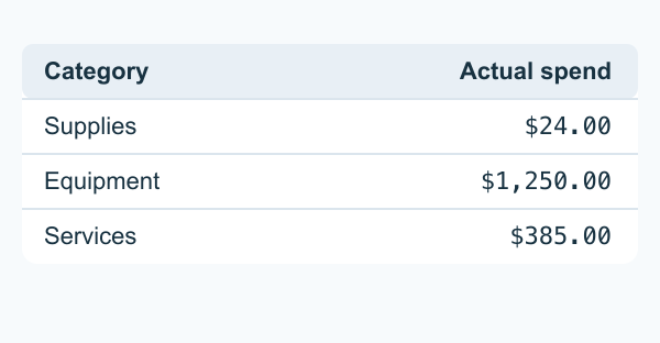
Use consistent formats for dates, amounts, and units. Right-align quantities so their digits line up, and use tabular numerals where available. Give rows enough breathing room to follow a value across the table. Subtle dividers or alternating row backgrounds can help when rows are wide.
Keep extra detail within reach
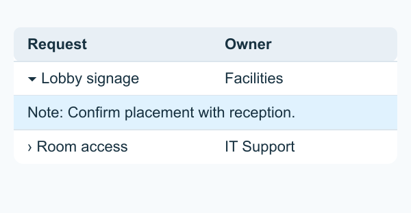
Move fields people inspect one record at a time, such as notes or activity history, into an expandable row or a detail panel. Keep a field in the main table if people need to compare it across records. Use plain labels where possible and reserve tooltips for supplemental explanations, such as the meaning of a familiar abbreviation.
Make statuses recognizable
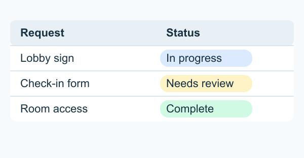
Use short, specific labels such as “Needs review” and “Complete.” Color can help those labels stand out, and the words carry the meaning on their own. Give the chip text enough contrast against its background and use the same label and color for the same status throughout the product.
Give readers ways to narrow the list
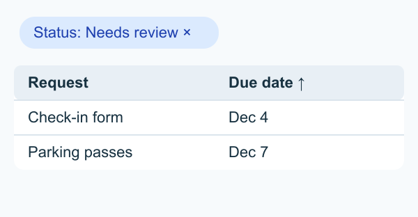
Choose a default sort that matches the most common task, such as earliest due date first. Add filters for fields people regularly use, such as owner or status, and keep active filters visible. If the table serves several roles, adjustable columns or saved views can let each person focus on the fields they need.
Keep readers oriented while scrolling
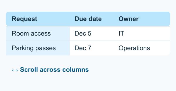
For long tables, consider sticky column headers. For wide tables, test whether keeping the first column visible helps readers track which record they’re on. On smaller screens, check that scrolling and row controls work with touch and keyboard, and that readers can still find the fields they need.
Try the table with a real task. Ask someone to find the next request that needs review, then watch where they pause or lose their place. That will tell you which change to make first.